
Stone cold values
Create form and light with a limited palette
This week we’re revisiting values. Getting light and dark right is the foundation of everything in painting. With correct values your painting will read clearly even if your colours are wonky. Get them wrong and no amount of wizardry will save it.
I was reminded this week in a watercolour class I took that statues and busts are brilliant for seeing and practicing values. The forms are clear and deliberate and you’re freed from the pressure of creating likeness. Plus, working in near-monochrome means you can focus entirely on seeing and translating light and dark.
Our eyes are better at seeing colour than value. We look at a red apple and a green leaf and think they're totally different, but squint at them and you might find they're nearly the same value.
Practice matters, and limiting your palette helps. Dating back to the Renaissance artists learned to draw and paint by studying classical sculpture, so it's one of the oldest and most effective ways to train your eye.
Exercises
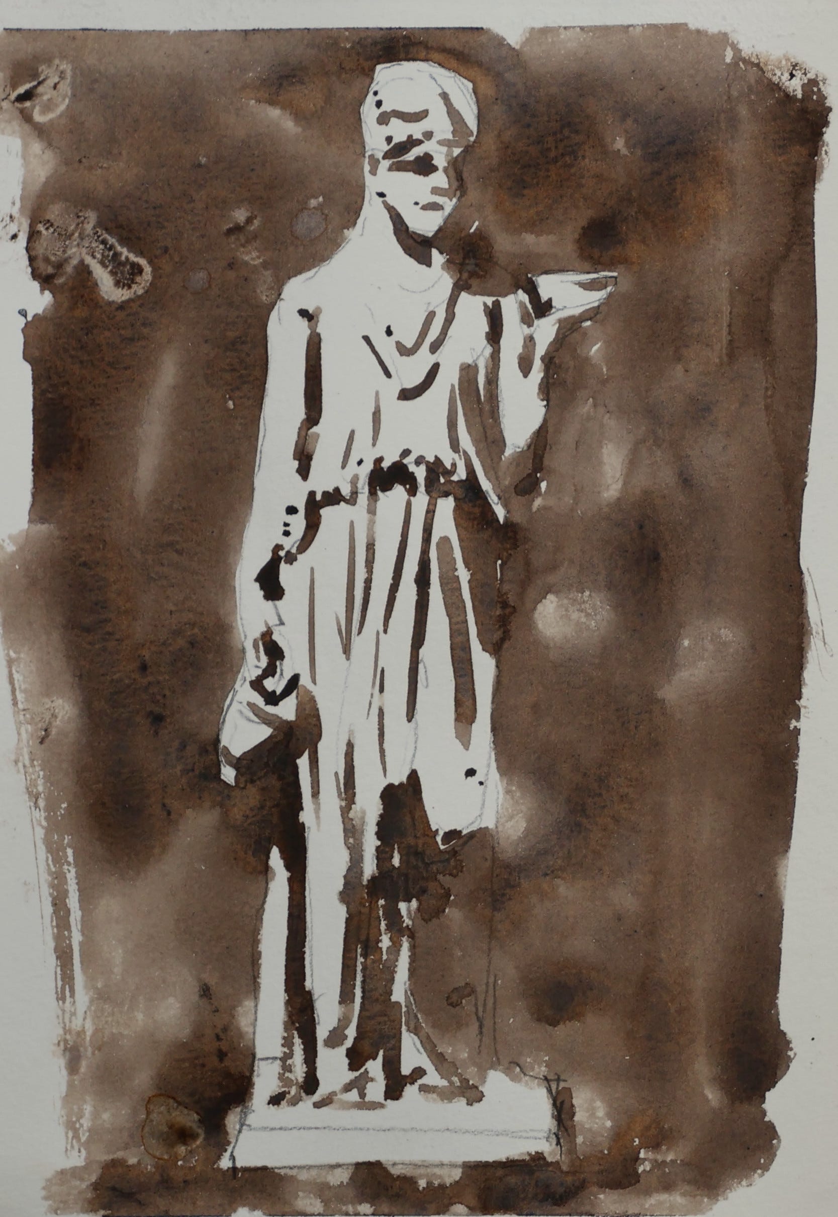
I’m working from free reference photos of statues and a nearly monochromatic palette. The goal is to see and paint values clearly, building form through light and shadow.
Exercise 1: Two-Value Study
Choose a reference that’s not too intricate and has strong lighting.
Use a mid-value grey or warm neutral (e.g. Payne’s Grey, Sepia, or a mix of Cobalt and Burnt Sienna)
Reduce to just two values: light (paper white) and dark (your colour)
Block in the dark shapes (including the background), leaving the light areas as white paper
Don’t worry about details. Focus on the big shapes of shadow
It’s ok to soften some of the edges and introduce some half-tones, it doesn’t have to be strictly “black & white”
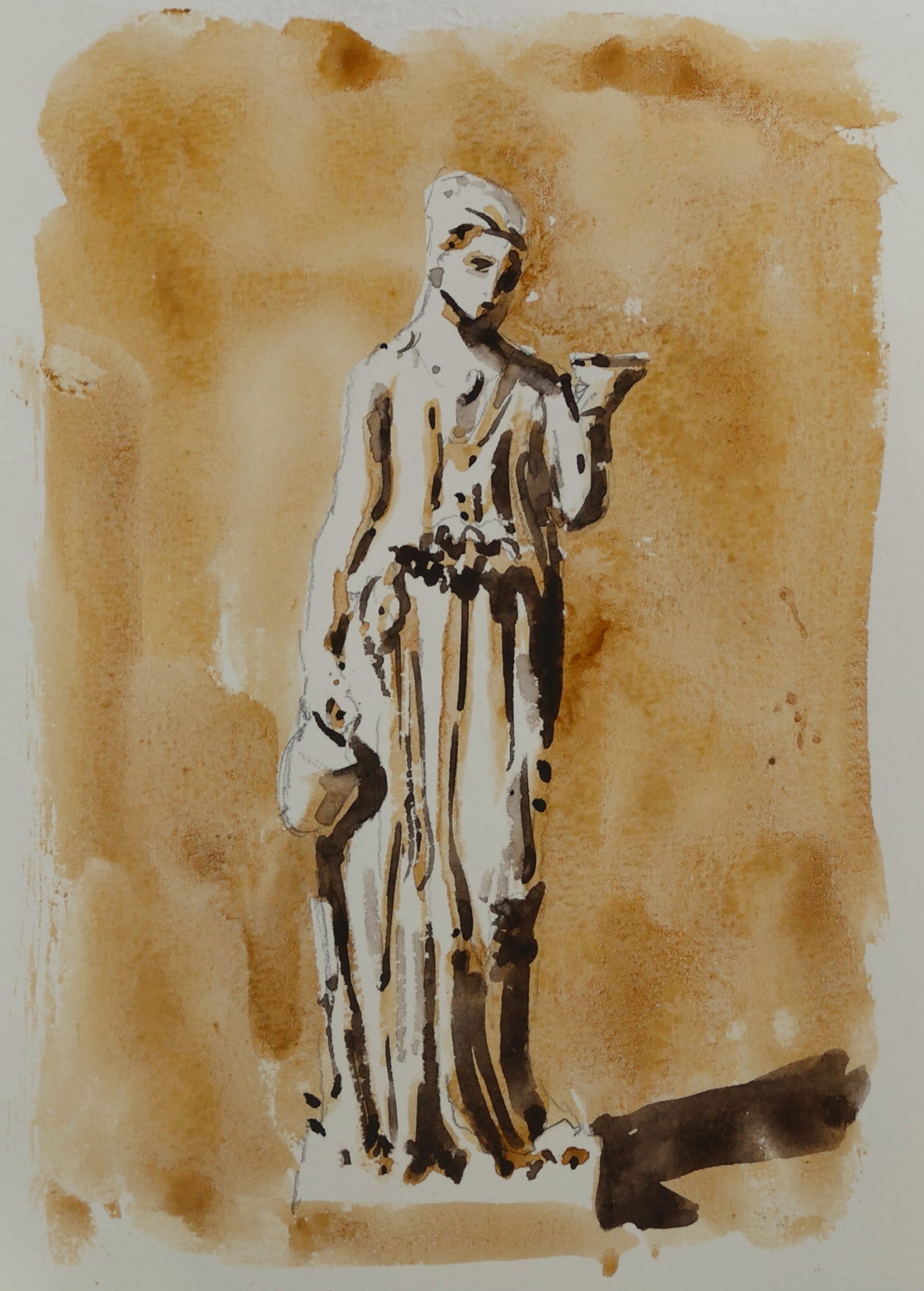
Exercise 2: Three-Value Study
Use the same reference
Paint the mid-tone by diluting your dark colour with more water, again leaving the light areas a white
When dry add the darkest value
Where needed you can add in-between values to soften the transitions
Digital tools can help you see values when you're learning, but the real skill is training your eye to see them directly. That's what these exercises build.
Exercise 3 - The next step
You’ve practised the fundamentals with simple forms. In the premium section below, I work through a lion statue, a more interesting subject and the kind of thing you’d encounter traveling or sketching outdoors.
I explain using warm and cool shadows to bring more life to the form. My aim is to bridge from practice studies to the kind of sketches you’d want to keep in your travel journal.
Why
Statues are great subjects, they’re static and the colours are already removed
The simple two-value study teaches the core skill of simplifying complex forms into shapes of light and dark
Value is the foundation of everything. Master this and your paintings will immediately read more clearly
Next up for premium subscribers:
Video tutorial of the exercises (plus bonus example) with commentary
How I transfer a photo reference to paper
Master artist spotlight
Ideas for taking this exercise further
It's not always black and white,
Patrick
