
Master Class - Tom Hoffmann
Learning from a master artist
This week’s Watercolour Workout is a little different.
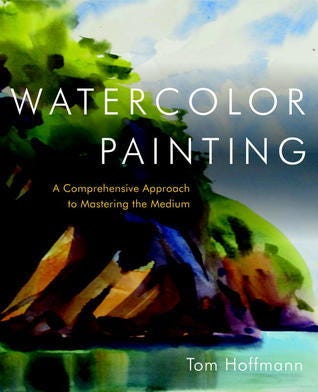
Tom Hoffmann, one of the great contemporary watercolour painters and teachers, passed away recently. His book “Watercolor Painting: A Comprehensive Approach to Mastering the Medium” is a classic and has been on my shelf for some time. I often dip into it when I feel stuck or want to be reminded of what really matters in a painting: value structure, shape design, and the courage to leave things out.
I can’t claim to have studied him deeply, or been taught directly by him. But I admire the directness and atmosphere in his work, and the clarity of his writing in the book.
So this week, we’re doing a small tribute by doing one of his value and colour exercises described in the book (p52).
The Exercise
We’ll paint a simple scene with strong shapes and clear value shifts, twice.
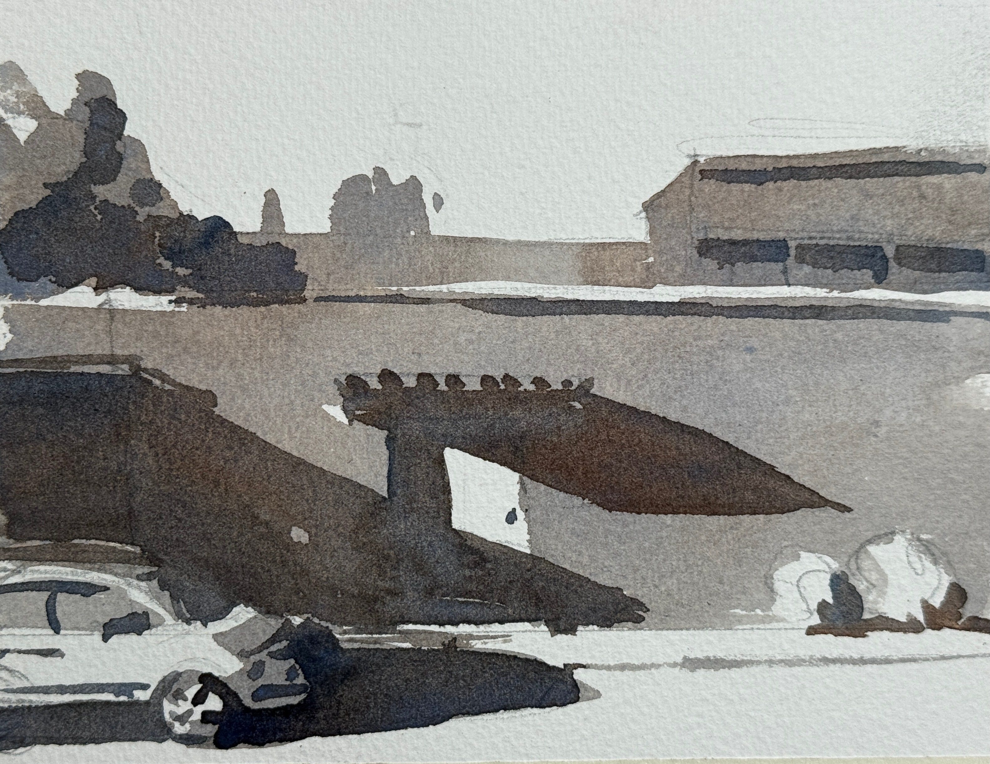
Here’s a reference similar to the one in the book.

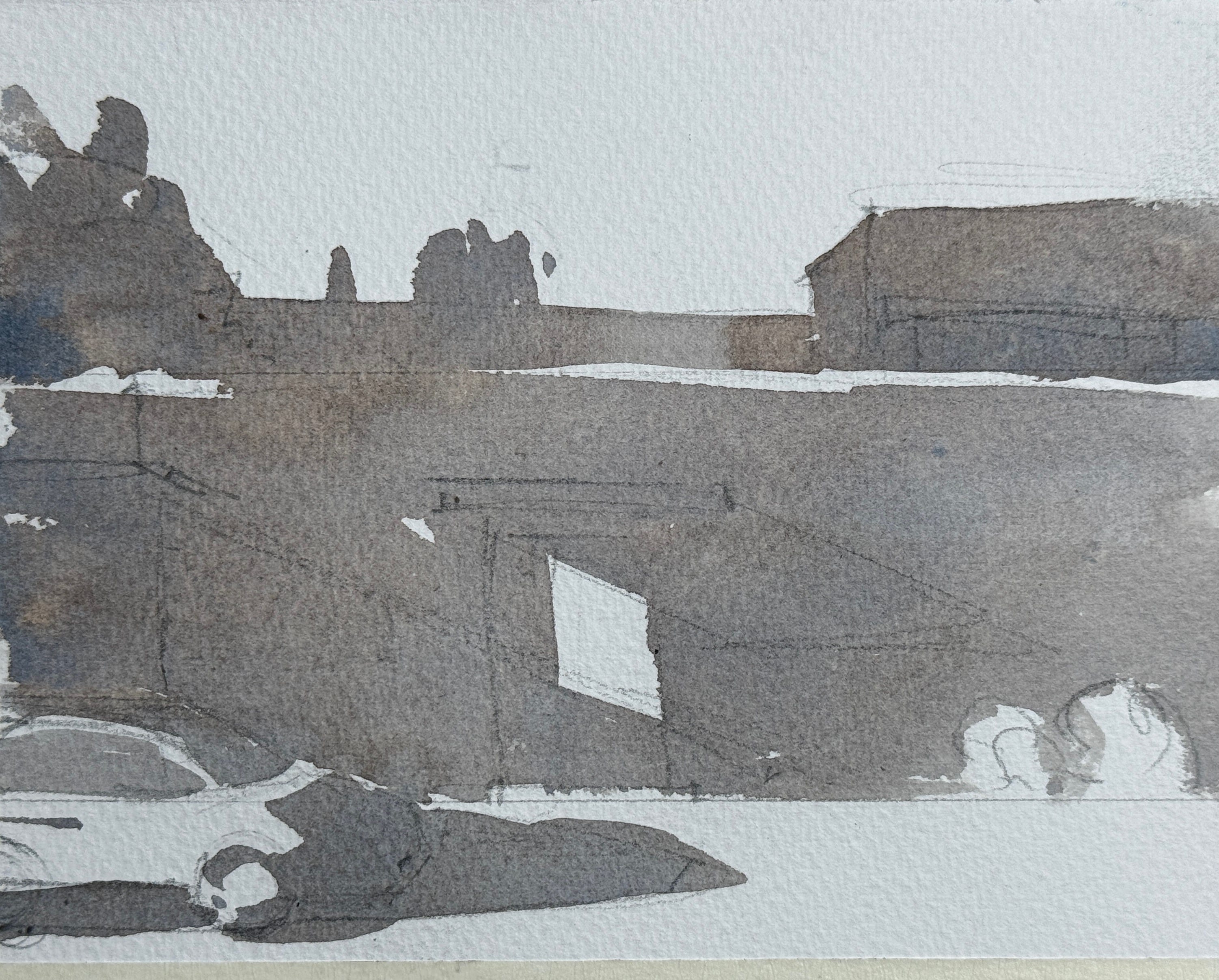
Step 1: Value Study (Monochrome)
Use a single colour (payne’s grey or neutral tint) and paint the scene in two layers:
Layer 1: All mid-value shapes, leaving the lightest areas as untouched paper.
Layer 2: Once dry, add your darkest shapes. Mostly the cast shadows in this reference.
Step 2: Colour Study
Now repaint the same scene in colour. The challenge is to match the value structure of your first study using colours.
Start with light washes for the light and mid shapes. Pay attention to each colour’s inherent value. Yellow is always light, blue can range, red gets dark quickly (like my garage door).
Once dry, mix darker versions of the colours to add your shadows. Don’t just use a single “shadow” colour (like Payne’s Grey); instead, use:
a deep green as a darkened wall tone
burnt sienna or brown as a darkened yellow
a muted crimson or violet for deeper reds
This makes your shadows more integrated and vibrant.
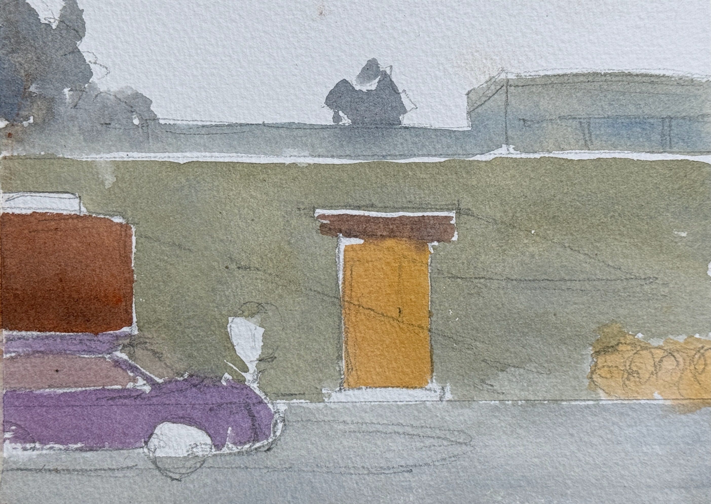
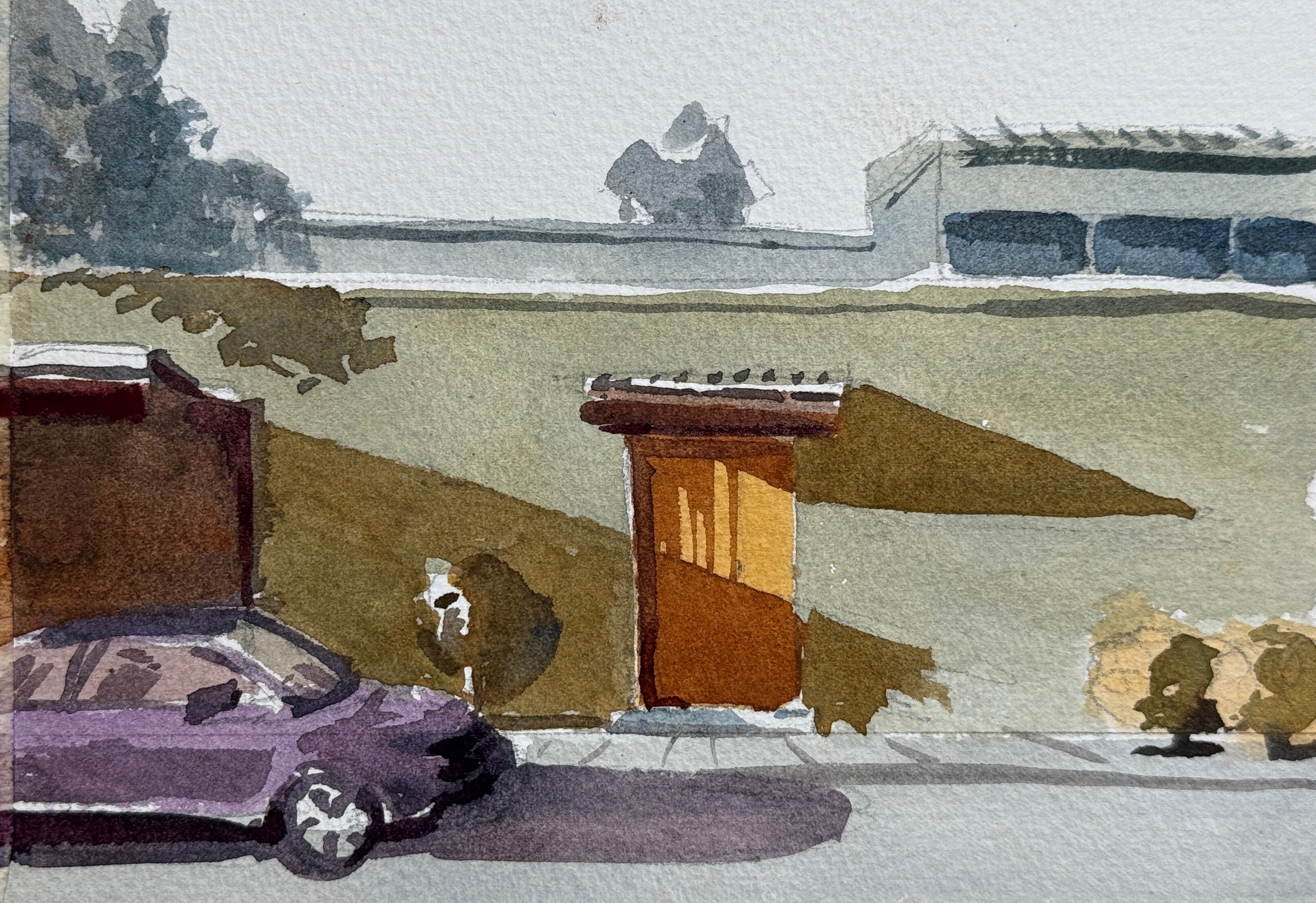
As always, done is better than perfect (look at my attempt at a car 😱)!
This isn’t about accuracy, it’s about learning to control value and simplify shape.
Why
Trains you to see value independent of colour—an essential painting skill
Builds your ability to simplify and group shapes into a readable design
Shows how to translate greyscale to colour while maintaining structure
Forces you to make choices about what to leave out, a central lesson in Hoffmann’s teaching
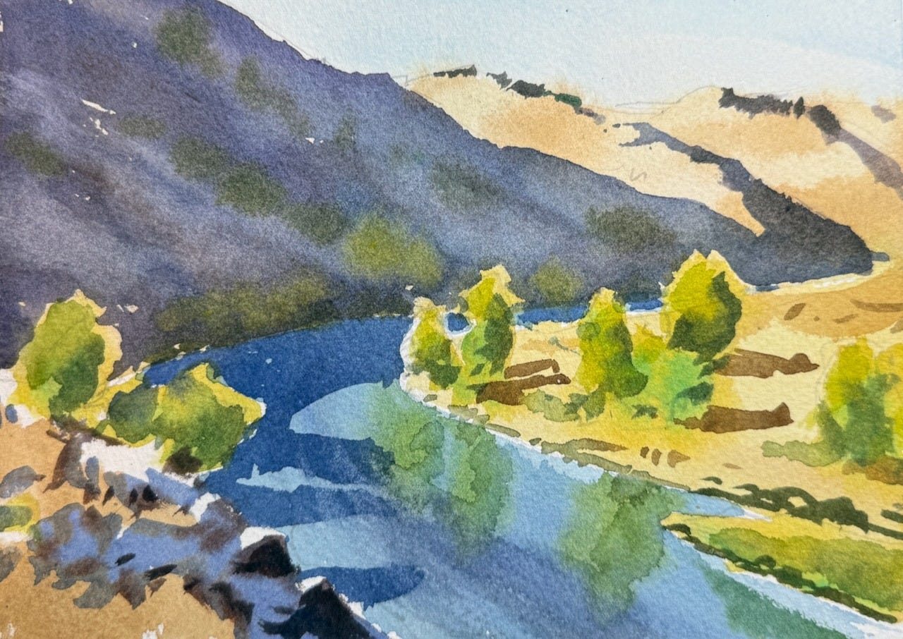
The premium section features 2 videos: the colour exercise above, and how I copy a Tom Hoffmann landscape, i.e. “reverse engineering” a painting by another artist.
I chose this painting because it demonstrates how a few well-placed shapes and strong value contrasts can create a compelling image.
Vale Tom Hoffman
