
Colour on Trial
How I test a new pigment
I can’t resist buying at least one thing when I’m in an art shop. I have all the brushes, paper and pigment I could ever want. But the urge is hard to resist.
So, this week I picked up a small tube of Old Holland “Scheveningen Orange” from the discount bin. As a Dutchman by birth, I spent many of my childhood summers on Scheveningen Beach near The Hague, so this has more sentimental value than practical use.
But sentimental or not, every new colour deserves a proper audition. In this week’s Watercolour Workout I’ll show you how I put a single colour to the test and decide if it’s going into the tin with all the other unused pigments, or the one with my regulars.
So, choose one of your neglected colours, or the one you bought recently and haven’t been able to try out. Let’s see what it can really do.
Exercise
I test a colour in 3 ways (and I’m using basic sketching paper):
Colour mixing with my staple colours
Paint a simple subject using it as the dominant colour with 1, maximum 2 other colours
Create a colour scheme—either complementary or analogous. We’re doing analogous this time.
Colour mixing
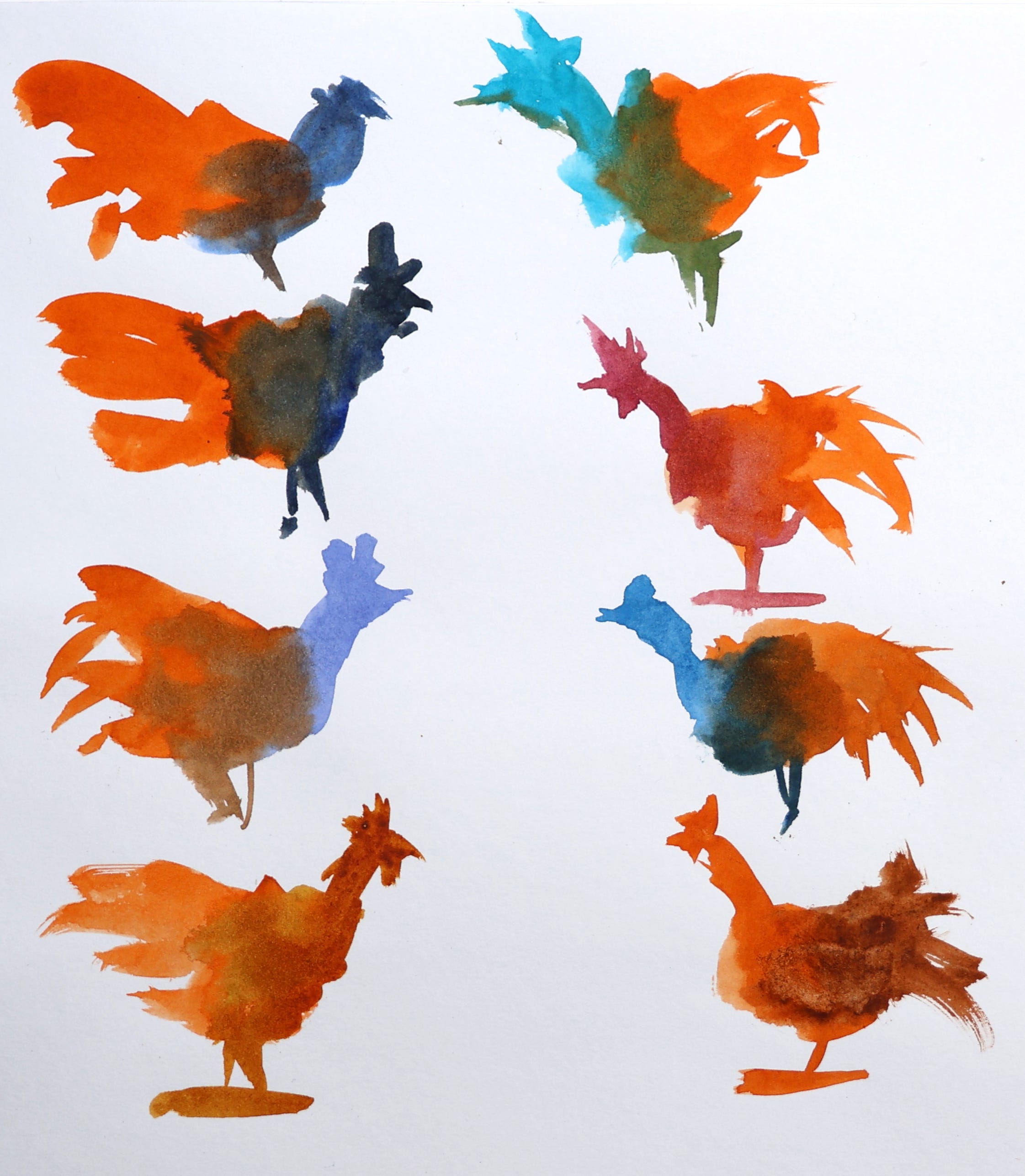
I’m not fond of swatching and painting grids or endless strips of overlapping paint. I like to use an exercise I picked up from David Millard: colour chickens. These are quick, loose blob shapes where you test how colours interact without the fuss of formal swatches. I use 2 brushes—one for the colour I’m testing (so I don’t have to wash it every time), and one for the mixing colours. This keeps things moving and lets you see lots of combinations quickly.
Painting
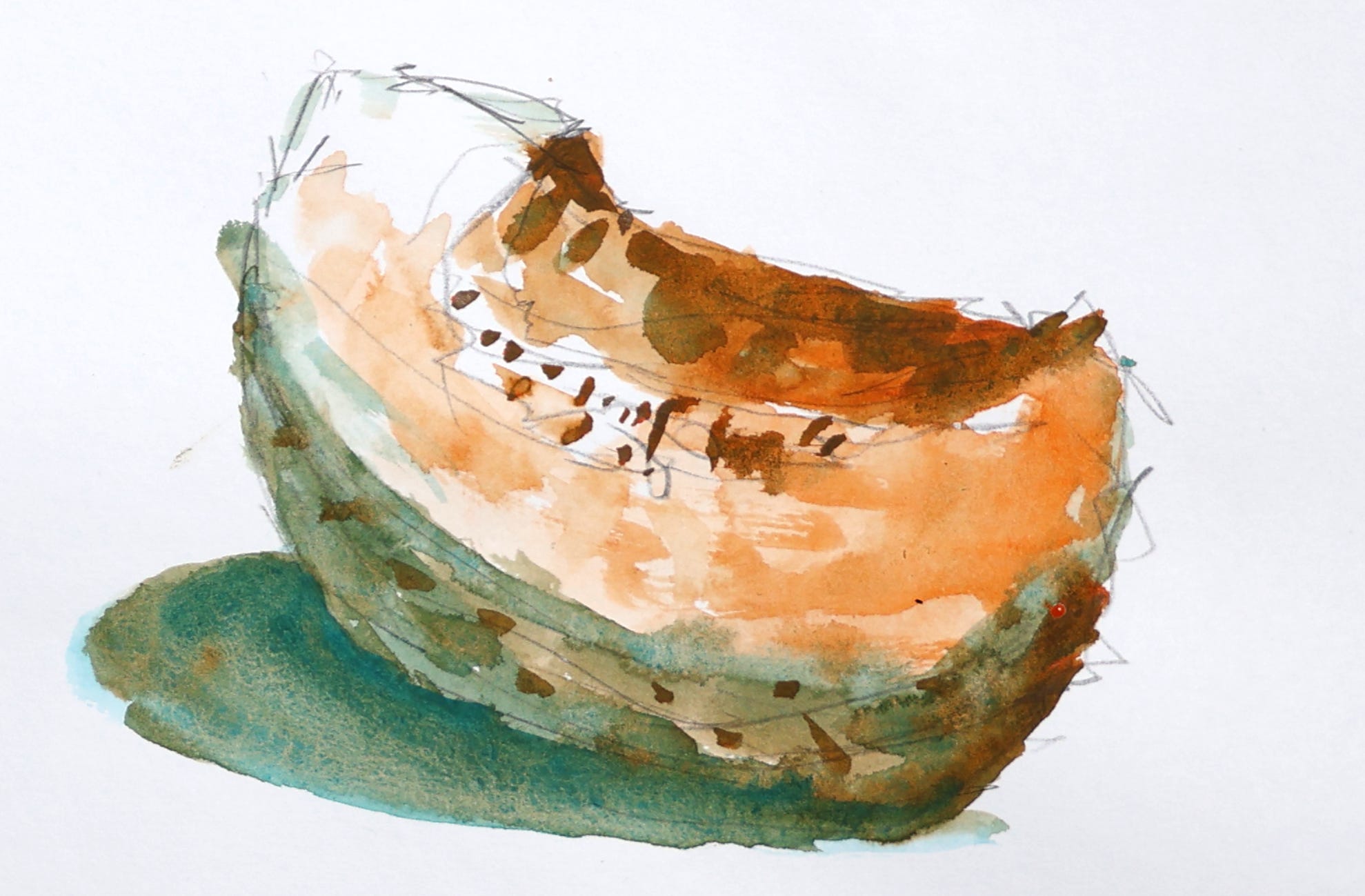
I choose an object, usually a fruit or vegetable, or something around the house (a cup, a trinket, etc.). Flowers are also good if your colour is vibrant or unusual.
Orange lends itself to, well, oranges and pumpkins. I’m going with a pumpkin for this one. Or is it a Honey Melon?
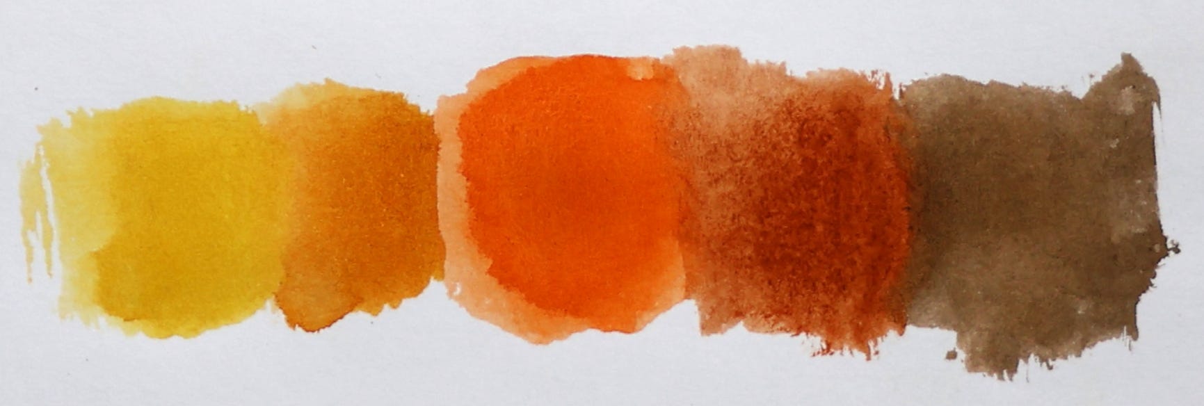
Colour scheme
I went for an analogous colour scheme, centering my orange around lighter and darker hues: Yellow, Aussie Gold, Burnt Sienna, and some Neutral Tint for the darkest value.
I then use these colours for a simple painting, like a mountain landscape (example in the Premium section with video demo).
Why
Find out if that new colour earns a place in your regular palette
Discover unexpected combinations you wouldn’t normally reach for
Practice loose, confident painting
Build your colour intuition for which colours harmonize or create tension
Colour me orange,
Patrick
Next up for premium subscribers:
Video tutorials of the exercises
Bonus video of a mini landscape
Master artist spotlight
Ideas for taking this exercise further
I don’t thank you enough for your Watercolour Workouts ...I come back to the exercises all the time especially when I feel stuck as to what to do!!
– Cecilee
Yes, I realise Black Friday is THIS weekend, so the offer still stands until Monday December 1.
💡Never run out of ideas of what to paint, even if you only have 10 minutes!
Black Friday offer: 20% off annual subscription
