
Colour Choices
Part 2 of Design before you paint
Last week you made four pencil thumbnails and chose your strongest composition. You solved the design problem before it became a painting problem. That’s the hard part done.
Now comes the part that’s genuinely exciting.
The same composition can become a completely different painting depending on the colour and temperature decisions you make before you start. Warm light or cool? Dramatic contrast or quiet harmony? Use the colours that you see, or invent a new palette?
These aren’t painting decisions. They’re planning decisions. And the place to make them is small, fast and without any pressure.
I came across this approach in a video by an artist I’m featuring in the master artist section below. That video is three hours long, only has a few hundred views, and is one of the most useful watercolour videos I’ve watched lately.
The idea is simple: before you commit to a full painting, run your thumbnail through a series of small colour studies. Same composition each time. Different light. You’ll know which one to paint before you’ve wasted a single sheet of good paper.
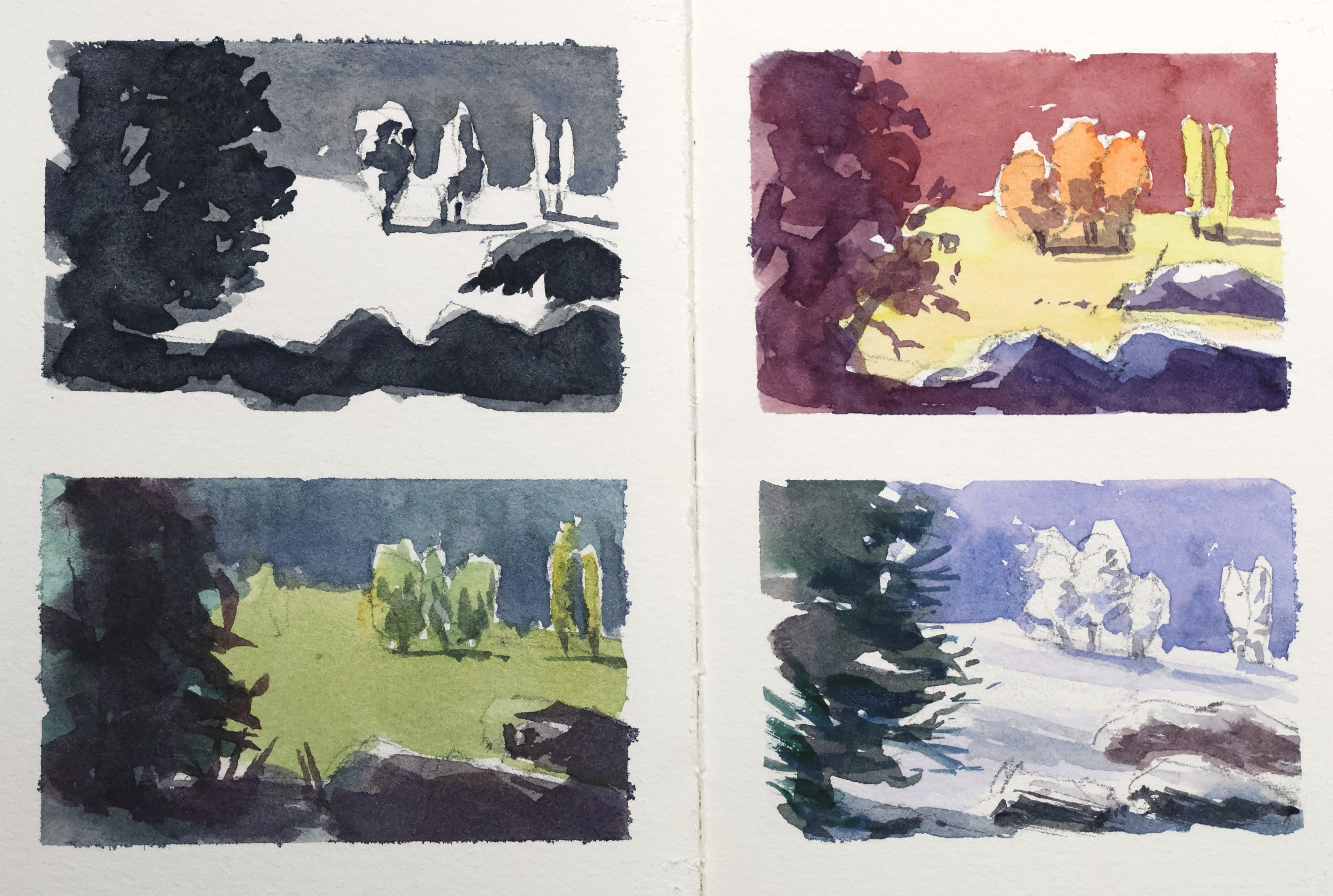
This week we’re doing exactly that. One page divided into quarters. Four studies. One value, three colour.
Exercise
Divide a page in your sketchbook into quarters. My studies are about 6 x 10cm (2.5 x 4 inches). I wouldn’t go larger. Small forces simplified studies, not mini paintings.
Start with a three-value study: white paper, a mid grey and a dark. Payne’s Grey works well, as does Neutral Tint or any black pigment
Using the same value plan, paint the scene in local colour. Greens for trees, grey for rocks, blue for water. This is your baseline
Now shift the mood. Try a different time of day, a different season, a different atmosphere. Push the temperature warmer or cooler than feels natural
In my example I’ve tried an analogous warm palette of yellows, reds and purples, and a cool winter version with lavender and cool greens
You don’t have to stop at four, but don’t do any less to explore your options.
If you’ve read this far and haven’t actually drawn a thumbnail yet, that’s the thing to do first.
Out of everything covered in these two posts (and all the others before that), this is the one habit that will move your painting forward the fastest, regardless of where you are right now. It works for beginners figuring out their first landscape. It works for experienced painters who keep overworking their still lifes.
The thumbnail sketch takes five minutes. The improvement it brings lasts forever.
Why
Separates colour decisions from painting decisions, so you’re not solving both problems at once
Running the same composition through different temperatures reveals which mood actually suits the subject, something you can’t know until you’ve tried it
A failed colour study costs five minutes. A failed full painting costs an afternoon
Choosing your palette before you paint means fewer mid-painting corrections and less overworking
I've posted a free video on Patreon where I critique a recent series of plein air paintings. Anyone can watch.
If you want to see what honest self-review looks like in practice, and why it matters as much as the planning stage, it's worth watching.
Watch it here
In the premium section:
Video demo of all 4 colour studies
Master artist spotlight - and link to the Youtube video
Access to my next Live Session this weekend
