
Add depth to landscapes
Aerial perspective creates distance
After last week’s look at overlap and scale in still lifes, those same tools work just as well in landscapes. But here we get two more powerful allies: value and colour temperature.
Together, these four tools overlap, scale, value, and temperature, are everything you need to create convincing depth. This week we’re focusing on the last two.
You may have heard of aerial perspective. It describes how the atmosphere affects what we see at distance. Colours become cooler, paler, and less distinct the further away they are. Edges soften. Contrast reduces. Painters have used this for centuries to create the illusion of deep space on a flat surface. The good news is that watercolour is almost perfectly suited to it.
These effects work individually, but combine them and your landscapes will start to feel like they actually have distance in them.
Exercises
You'll need a round brush and a basic colour palette. Decent quality paper helps here, since you'll be glazing some layers and cheaper paper can pill when damp.
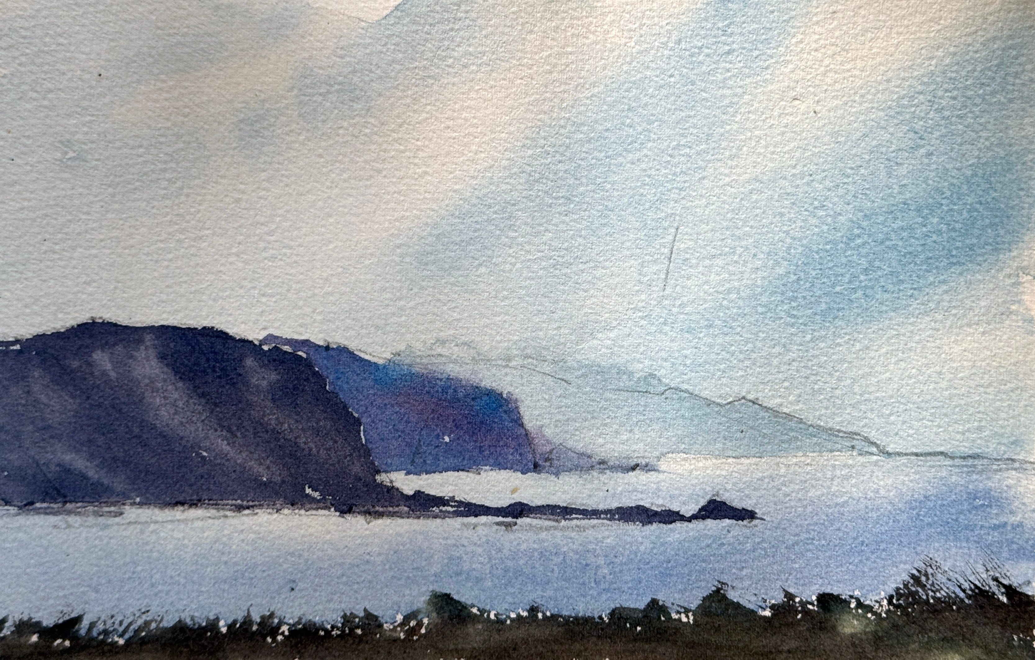
Exercise 1: Value
Choose a reference with overlapping hills or mountains
Start with a very light wash for the sky, painting through the most distant hill
Let this layer dry completely before continuing
Mix a slightly stronger version of the same colour and glaze over the most distant hill. Keep it pale, just a step darker than the sky
For a hard edge between hills, let this dry before painting the next one. For a softer, more atmospheric edge, paint the next hill while the previous layer is still slightly damp
Continue strengthening the value of each layer as you move forward
The frontmost hill should read as mid-to-dark. This contrast is what creates the sense of distance. Without it, everything sits on the same plane
If you’re a beginner start with 3 overlapping hills: light, middle and dark value.
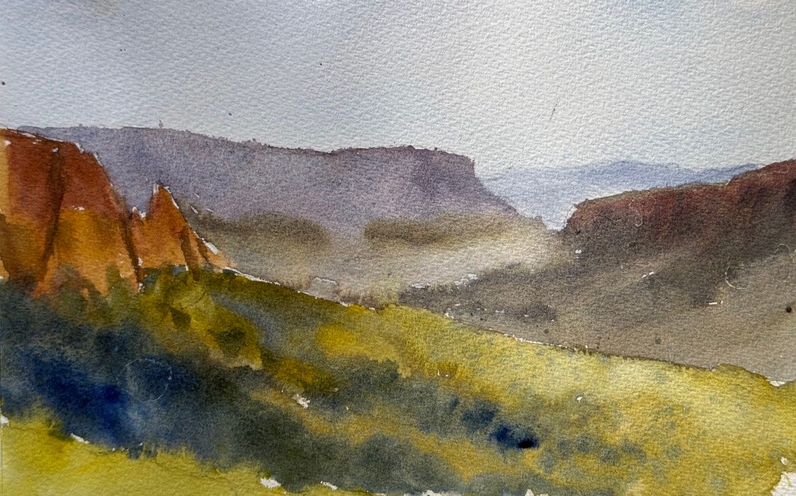
Exercise 2: temperature
Now we’re adding colour temperature on top of value. The result is the most complete version of aerial perspective, and what will make your landscapes feel genuinely three-dimensional.
As we move towards the foreground, we shift from cool blues and greys to warmer earth tones — reds, oranges, browns, greens. This temperature shift is what makes a landscape feel like it has air in it. The distant hills sit behind a veil of atmosphere; the foreground pushes towards you.
Use a similar reference, or paint the same one again
Approach it the same way as Exercise 1, building values from light to dark as you move forward
In addition, make your mixes progressively warmer as you approach the front
The combination of darker values and warmer colours in the foreground does a lot of the work for you
Why
Aerial perspective is one of the most powerful tools for avoiding flat, lifeless landscapes. And once you see it, you can’t unsee it
You’ll start thinking about colour temperature as a deliberate choice, not just an accident of what’s on your palette
Glazing builds patience and control, and teaches you to work in layers rather than trying to solve everything in one pass
It's always easier said than done. That's why every exercise comes with a video demo in the paid newsletter, so you can watch exactly what I'm doing before you pick up your brush. If you're ready to move from reading to painting, the full Watercolour Workout is waiting for you below.
“What a brilliant demo. As ever…” – Rose
